
Organics Studio Ink Bottle - Ralph Waldo Emerson Twilight Blue (SHEEN)



Configurer
Intellectual Depth: Organics Studio Ink – Ralph Waldo Emerson Twilight Blue
Embrace the evening sky with Organics Studio Ralph Waldo Emerson, commonly known as Twilight Blue. As a cornerstone of the "Masters of Writing" series, this ink pays homage to the leader of the transcendentalist movement. Designed to capture the profound, shifting colors of the sky at dusk, it offers a sophisticated writing experience that bridges the gap between professional utility and artistic flair.
Twilight Blue is a world-class "Sheen Monster." While its base is a moody, deep navy blue, it is famously saturated with dyes that crystallize upon drying to create a massive, reflective Metallic Copper/Red Sheen.
✨ Signature Features: The Transcendental Navy
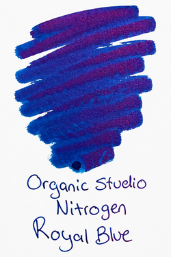
Emerson Twilight Blue is favored by enthusiasts who want a darker, more "serious" base color than its sibling, Nitrogen, but with the same legendary sheen performance.
-
Deep Twilight Navy Base: A dark, authoritative blue that leans toward the black-blue end of the spectrum. It provides exceptional contrast on the page, making it suitable for both journaling and professional correspondence.
-
Massive Copper-Red Sheen: On ink-resistant paper, the navy base is nearly overtaken by a brilliant, metallic copper sheen. In areas where the ink pools, the text can appear to be embossed in polished metal.
-
"Masters of Writing" Series: This series focuses on the intersection of literature and chemistry, utilizing high dye concentrations to produce inks with "limitless" character and depth.
-
Handmade in Maryland: Small-batch brewed by Tyler Dahl, ensuring the chemical tension required to produce a surface-drying sheen that doesn't just soak into the paper fibers.
-
Exceptional Shading: In drier writing pens, you will see a beautiful transition from a dusty denim blue to a midnight navy.
🖋️ Best Practices for Twilight Blue
To truly "transcend" the ordinary with this ink, follow these expert tips:
-
The Paper Requirement: To see the copper sheen, you must use fountain pen-friendly, non-absorbent paper. Tomoe River is the gold standard for Emerson, but Midori MD and Rhodia also yield excellent metallic results.
-
Dilution for Daily Use: Because it is so saturated, Emerson can be prone to "hard starts" if the pen is left uncapped for even a short period. Adding 10% distilled water to a sample vial of the ink can improve flow and reduce drying time without significantly diminishing the sheen.
-
Avoid Smudging: Like all high-sheen inks, the metallic layer remains sensitive to moisture. Use a "blotter" or an extra sheet of paper under your hand to prevent the oils from your skin from smearing the copper surface.
-
Pen Selection: A Medium or Broad nib is highly recommended. These nibs lay down the "puddle" of ink necessary for the copper crystals to form as the water evaporates.
The Enthusiast’s Note: "Emerson is my favorite of the Organics Studio 'Big Three' (Nitrogen, Walden, Emerson). It feels the most wearable for daily use. On standard paper, it looks like a nice, dark professional navy. But on the good stuff? It looks like you're writing with liquid copper. It’s the perfect 'sleeper' ink for someone who wants hidden drama in their notebook."